Overview
TaskMate is a mobile-friendly web application built to consolidate academic task management into one place. Students can track pending assignments, mark tasks complete, organize by course and priority, collaborate with groups, and get answers through a built-in FAQ, all from any device through the browser.
The project was built as part of BCIT's Design Thinking & Communication course (COMM 1800, Team DTC 09), following the full design-thinking framework from problem identification through to a working, deployed prototype.
Problem statement
Target users
- Undergraduate, high school, and graduate students
- Typically managing 4 to 6 courses simultaneously
The challenge
- Academic tasks and deadlines are scattered across multiple disconnected apps
- Students miss deadlines and lose motivation as a result
- Existing tools are too complex or don't integrate scheduling with tasks
Our solution
TaskMate provides a unified platform that consolidates academic tasks in one place, with real-time updates, filtering, and collaborative features built for students specifically.
Application screens
TaskMate is built around five core screens, each designed for a specific user need:
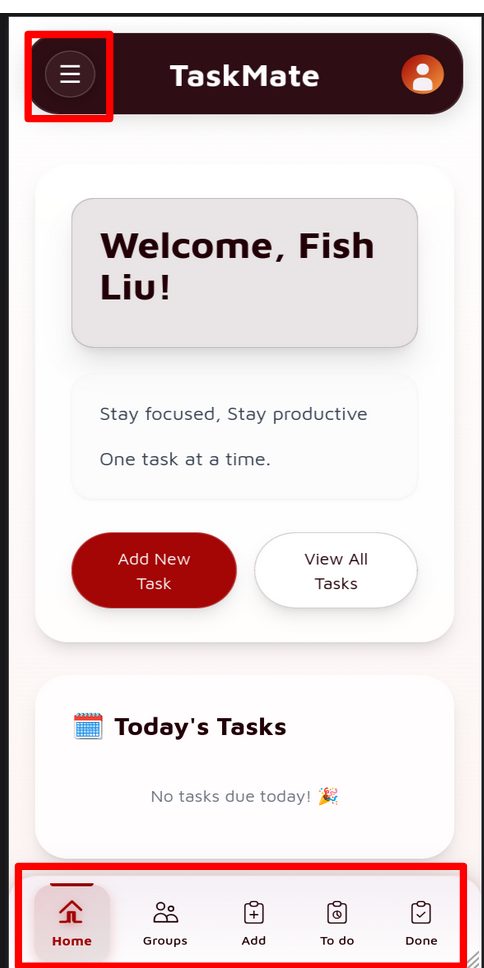
Personalized welcome with today's tasks
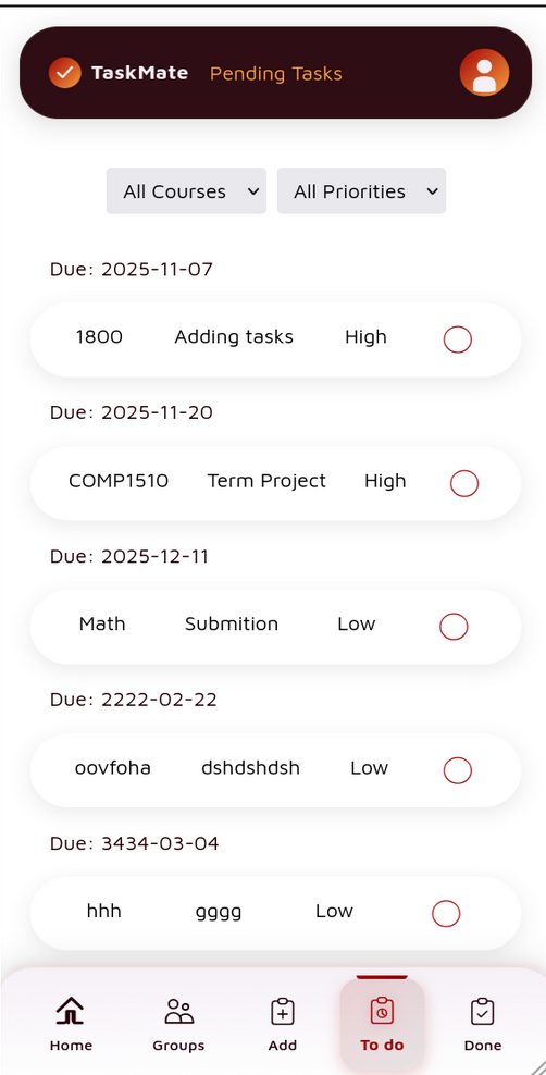
All incomplete tasks sorted by due date
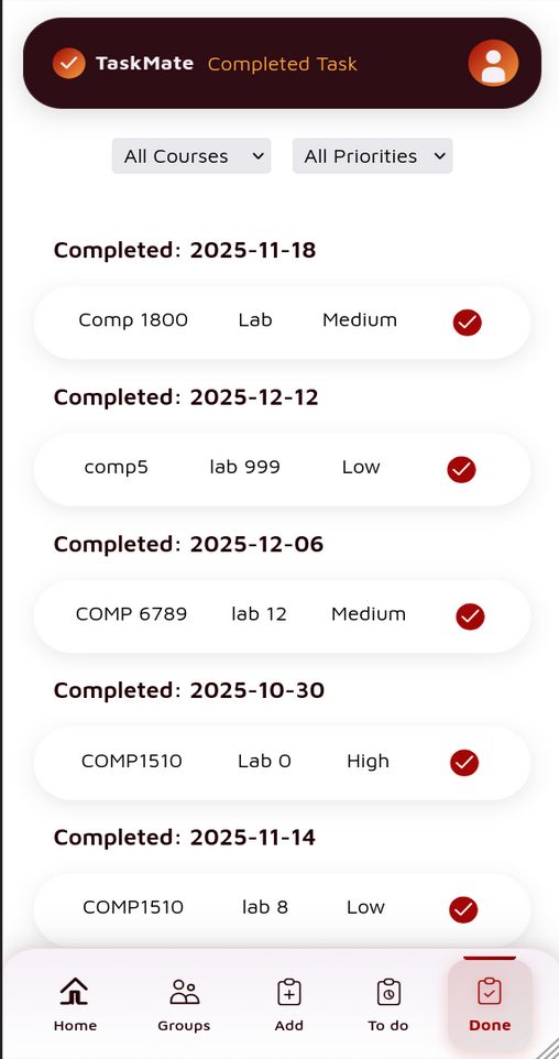
Progress history and completion tracking
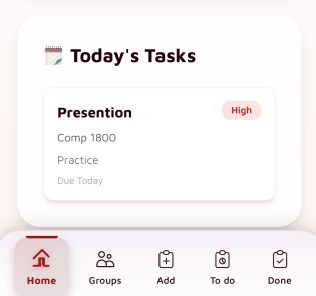
Priority badges and course context
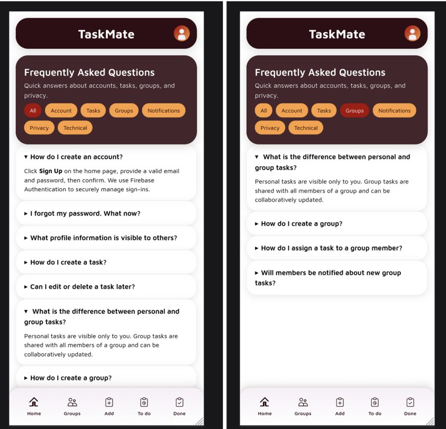
Categorized Q&A with expandable answers
Screen-by-screen breakdown
Home dashboard (screen 1)
The home screen greets users by name (e.g. "Welcome, Fish Liu!") with the tagline: "Stay focused. Stay productive. One task at a time."
Key UI elements:
- Hamburger menu (top-left) for navigation settings
- User profile icon (top-right)
- "Add new task" button (primary CTA)
- "View all tasks" button (secondary CTA)
- "Today's tasks" section, showing tasks due today or a celebration state when clear
- Bottom navigation bar with five tabs: Home, Groups, Add, To Do, Done
Pending tasks / To Do (screen 2)
The To Do view displays all incomplete tasks sorted chronologically by due date.
Each task card shows:
- Course name (e.g. COMP1510, Math, 1800)
- Task name (e.g. Term project, Submission)
- Priority level: high / medium / low
- An empty circle on the right to mark as complete
Filter controls let users narrow by course or priority for quick access to relevant tasks.
Completed tasks / Done (screen 3)
The Done view mirrors the To Do layout but shows completed tasks with a filled checkmark. Tasks are grouped by completion date, acting as a progress tracker so students can see what they've gotten through over the term.
Task card detail (screen 4)
A focused view of task information when expanded, showing:
- Task name
- Priority badge (color-coded)
- Course identifier
- Category / course section
- Due date status
FAQ / help page (screen 5)
A categorized, expandable FAQ. Categories include: All, Account, Tasks, Groups, Notifications, Privacy, Technical. Users can filter by category and expand accordion-style items to reveal answers inline. This is also where the app's group and collaboration features are documented for users.
Key features
- Personalized dashboard: user-specific welcome and task views based on enrolled courses
- Today's tasks widget: quick view of urgent tasks with priority badges on the home screen
- Pending & completion tracking: separate To Do and Done views with filtering
- Group collaboration: shared group tasks and collaborative assignment management
- Filtering: by course, priority level, or due date
- Firebase authentication: email and password sign-in
- Built-in FAQ & help: categorized help system with searchable answers
Technology stack
Frontend
Backend & authentication
Database & hosting
Design approach
Color palette
- Primary: deep maroon / dark red (header, active nav, primary buttons)
- Accent: warm red-orange (priority badges, active tab icons)
- Background: light grey / off-white
- Cards: white with soft shadow
Navigation pattern
- Bottom tab bar (5 tabs), the standard mobile pattern for thumb reach
- Active tab highlighted in dark red with label
- Hamburger menu for secondary settings
Priority indicators
- High: red/orange pill badge for immediate visibility
- Medium: neutral styling
- Low: lighter, de-emphasized styling
Learning outcomes
- Applied design-thinking methodology from problem scoping through prototyping
- Built a full-stack web app with Firebase real-time database and authentication
- Designed for mobile-first UX with accessible navigation
- Collaborated as a team to deliver a working app within course constraints
- Implemented filtering and dynamic UI rendering with vanilla JavaScript