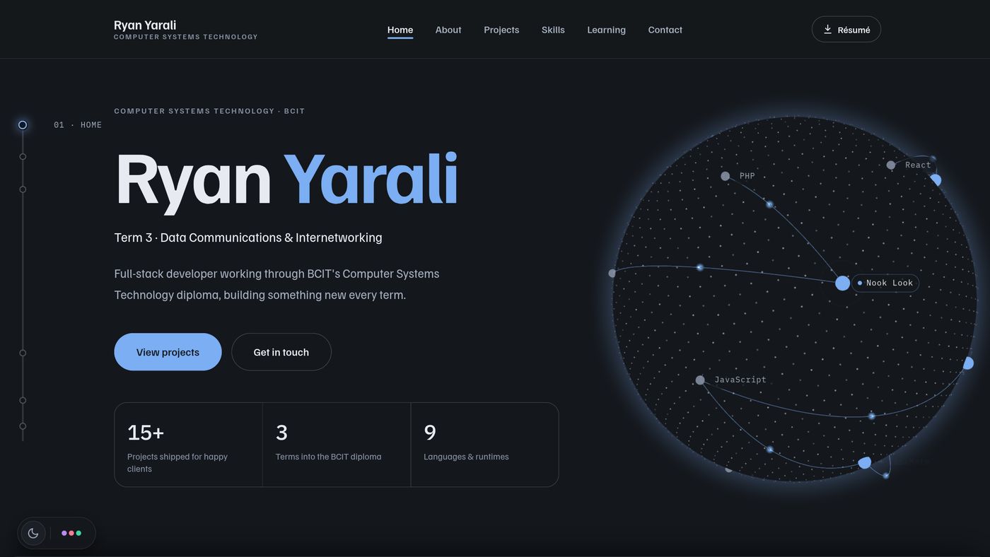
Overview
A portfolio is the one project every reviewer opens, so this one is meant to show both halves of what I do: the design and motion work people notice in the first ten seconds, and the engineering underneath that they only notice if it is missing.
It is plain HTML, CSS and JavaScript on GitHub Pages. There is no framework and no build step, and the one library is three.js for the globe. Every word on the site is in the HTML, so it reads the same to a recruiter, a screen reader and a search crawler.
The brief
- Make people stop and look, without making anyone wait: the page has to be usable at once, by someone who will give it thirty seconds
- No framework and no build tooling; anything new has to work by linking one file from the HTML
- Readable without JavaScript, and fully indexable, including by link-preview bots that never run a script
- WCAG AA contrast in all six colour palettes, in light and dark, and a calm version of everything for visitors who ask their system for reduced motion
- Nothing on the page that is not true, including the numbers
The idea
I study Data Communications and Cyber Security, so the site is built around what happens between the client and the server, and it uses real data wherever it shows any:
- The intro prints the TCP handshake that opened the connection to the page, with the connection time read from the Navigation Timing API. When the browser reused a connection there is nothing to report, so the time is left off.
- The globe is a network whose labelled nodes are my projects and the tools they are built with. Every link is a real "built with" relationship, and packets run along the links.
- The route winds down the whole page like a timeline. It runs down one edge of a section, sweeps across the open space above the next heading, and lights each heading as a hop; on the home page it turns and runs sideways under the project gallery, and it ends at the contact form.
- Ping rides the head of the route: a small packet creature, since a ping is how one machine says hello and the answer is a pong. He says hello when you arrive, points at each section, carries the contact form's message to the inbox, and waves goodbye at the end.
- The contact form draws the request as a packet travelling to the inbox and logs the real host, status code and round-trip time of the request.
Motion
The hero globe
A three.js scene with custom shaders: a sphere of points that fade toward the limb, an atmosphere shell, and an opaque core in the page colour so the far side is hidden like a real planet's. Colours come from the live palette tokens, so the globe changes with the theme and the six palettes. It leans toward the pointer and can be spun by dragging.
Page-by-page stacking
Each section on the home page is sticky and slides over the one before it, which sinks back and fades. Sections taller than the screen scroll through first, then hold. All of it is driven from scroll position and each section's place in the flow, never by reading layout on every frame.
The work gallery
On a wide screen the projects section holds while vertical scroll slides the cards sideways. On a phone the same cards are a native swipe carousel. Clicking a case study's card morphs its image into the case study's cover, using cross-document View Transitions; browsers without them just navigate.
Smaller details
The name decodes out of random characters, the About text lights up word by word as it is read, the portrait tilts toward the pointer, and a cursor ring follows the real pointer, wrapping buttons and reading "View" over images.
Performance
- three.js (about 190 KB compressed) loads only after the page has finished loading and the browser is idle. Until then, and for visitors without WebGL or with Data Saver on, a CSS poster stands in.
- The globe renders only while the hero is on screen, the tab is in front, and the hero is not covered by the sections stacked over it.
- Scroll effects share one measurement pass and one frame-throttled scroll handler, and animate only transform, opacity, clip-path and filter.
Accessibility
- Under reduced motion there is no intro, no stacking and no pinned gallery, and the globe is a still frame; the content and layout are otherwise the same.
- The cursor ring never replaces the system pointer, so custom pointer sizes and precise selection keep working.
- Decorative layers (the globe, the route, Ping, the marquee) are hidden from assistive technology; the same facts are in the page text.
- Tabbing to a gallery card that is off to the side scrolls the page to it, and the contact form's result is announced in a live region.
What I left out
Some choices were about restraint. I dropped smooth-scroll hijacking, which feels laggy on trackpads and fights keyboard users. The intro is short and any input skips it, because every recruiter is a first-time visitor. And the cursor adds to the pointer rather than replacing it.
How it was made
I designed and built the redesign with Claude Code, an AI coding assistant, as a pair programmer. I set the direction and made the calls on this page, reviewed each stage in the browser, and the code went through Lighthouse and Chrome DevTools checks at every step.