Overview
Nook Look is a portrait photography studio in Coquitlam, BC, covering newborn, maternity, birthday, and outdoor family sessions across Greater Vancouver. The owners, Arefe and Pary, needed a complete web presence from nothing: something that could take bookings, show real work, and feel as unhurried as the photography itself.
I built, styled, and launched the whole site on my own, and stayed on afterwards as their ongoing web partner for design refinement, content updates, and technical fixes as the studio grew.
The site
The brief
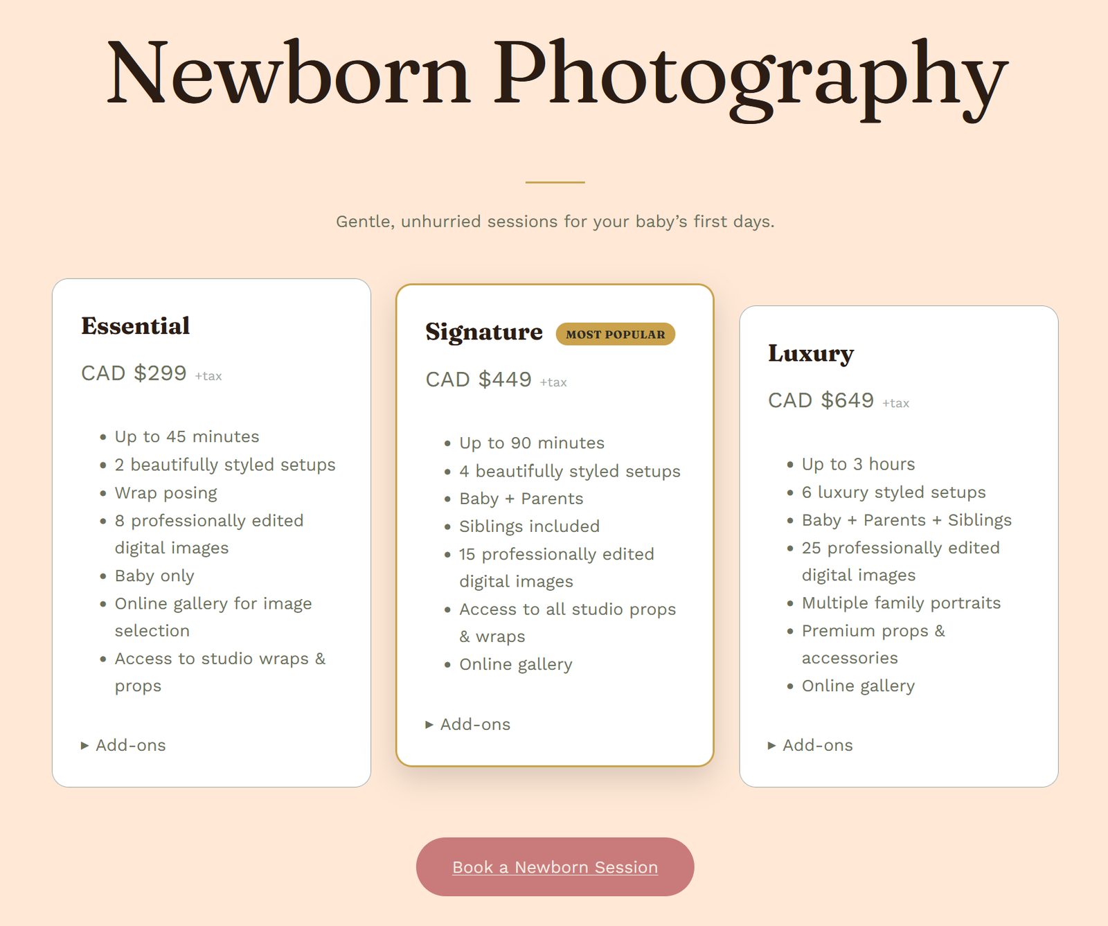
- Four session types, each with three pricing tiers (Essential, Signature, Luxury) and a shared add-ons list
- A warm, editorial design language, with nothing that read as templated
- Working booking and contact forms, a filterable gallery, and a Google-connected contact page
- Local SEO groundwork so the studio could rank in Coquitlam and Greater Vancouver from launch
- No recurring software cost beyond hosting: every tool had to be free-tier or already included
- An owner who could run promotions, popups, and pricing from the dashboard without touching code
Design system
I built the design direction and token set from scratch rather than starting from a theme demo.
Typography
Fraunces for headings, for the editorial feel; Work Sans for body copy, for legibility at small sizes.
The curved signature
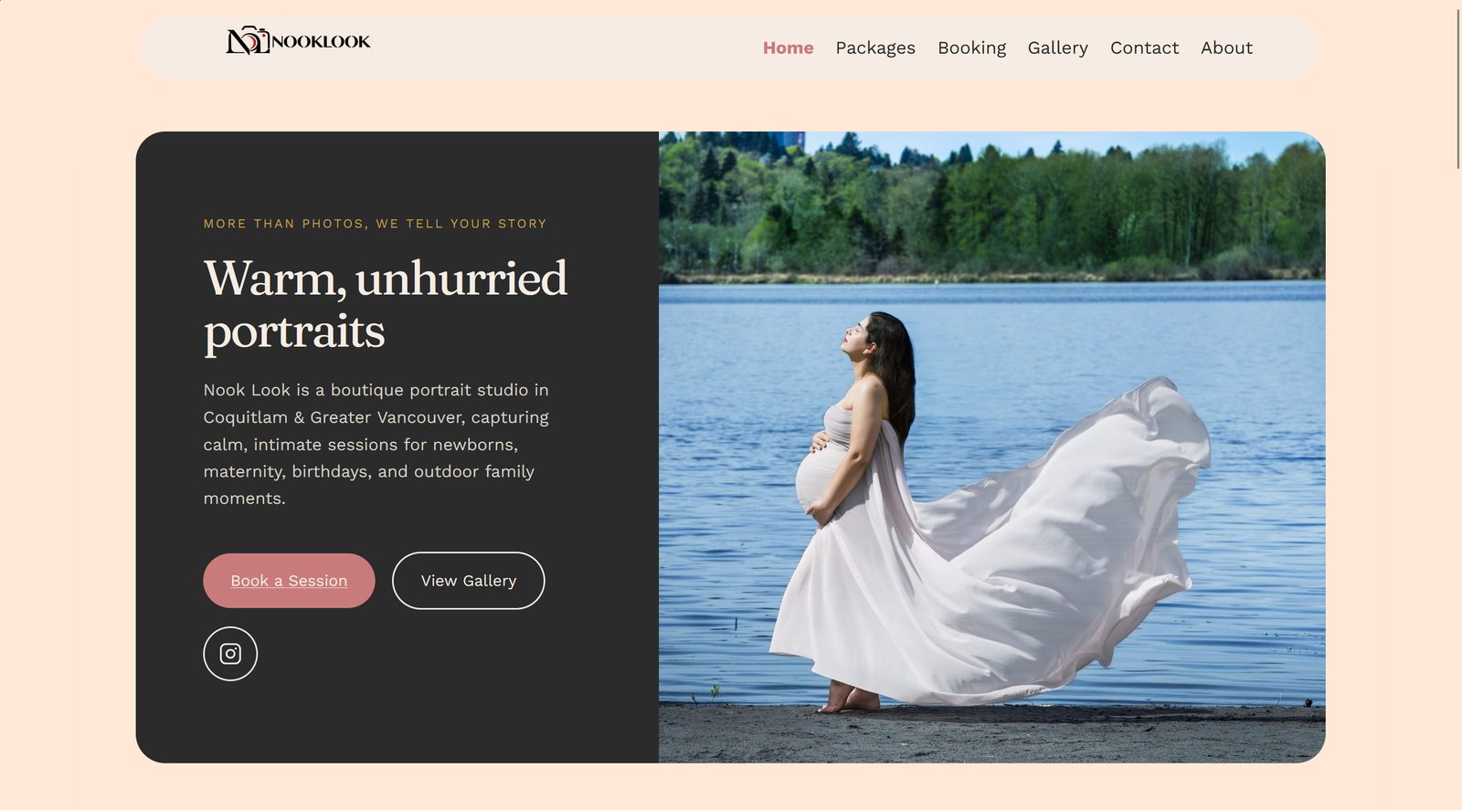
One rule carried across the whole site: pill-shaped navigation, buttons, and badges; 16px radius on photo cards; 12px on form fields. The gold divider lines and the typography stay sharp and unrounded, as deliberate contrast against all that softness.
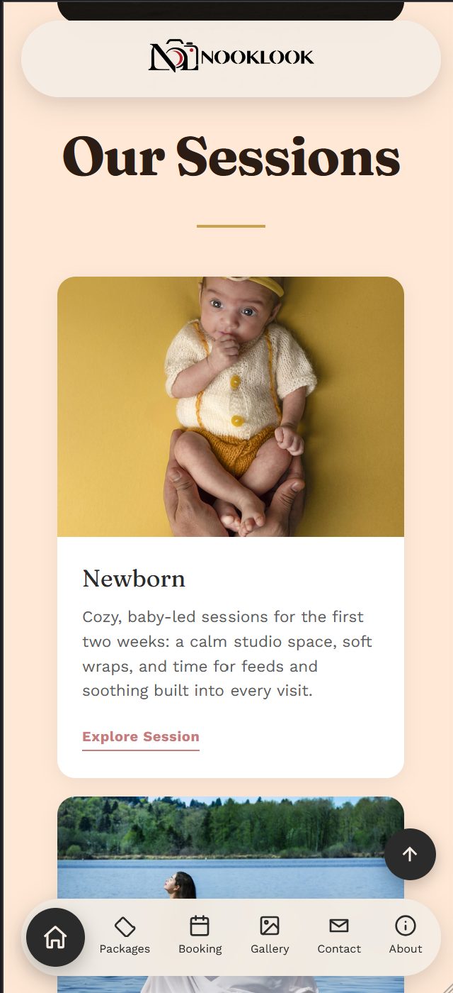
The header is a floating pill that hides on scroll-down and returns on scroll-up. Mobile gets a different pattern entirely: a logo-only pill at the top, and a separate floating pill navigation bar at the bottom carrying all six destinations as icons, positioned for thumbs rather than buried in a hamburger menu.
Tech stack
Every tool here is free-tier or included with hosting.
Why it is built this way
Pods provides the custom post types behind Services, Packages, and Gallery Items, plus a client-editable settings page. WPCode carries every piece of custom CSS, PHP, and JS as a managed snippet rather than an edit to theme files, so nothing is lost when the theme updates. The LocalBusiness structured data is hand-written JSON-LD rather than plugin output, because I wanted exact control over what Google indexes.
What I built
Session and pricing pages
Four dedicated session pages, each with a full Essential/Signature/Luxury breakdown and a "Most Popular" callout on the middle tier. Add-ons (prints, canvases, albums, extra edited images) sit behind a per-tier disclosure rather than on the card, so three columns stay scannable side by side instead of turning into a wall of bullets. A Packages hub page puts all four session types together for people comparing before they book.
Home page
An editorial split hero pairs a rounded charcoal text panel with a full-bleed photograph, leading into a four-card sessions grid and a studio introduction. The testimonials and booking call-to-action are merged into a single dark card with an auto-advancing review carousel, rather than left as two disconnected stacked sections.
Gallery
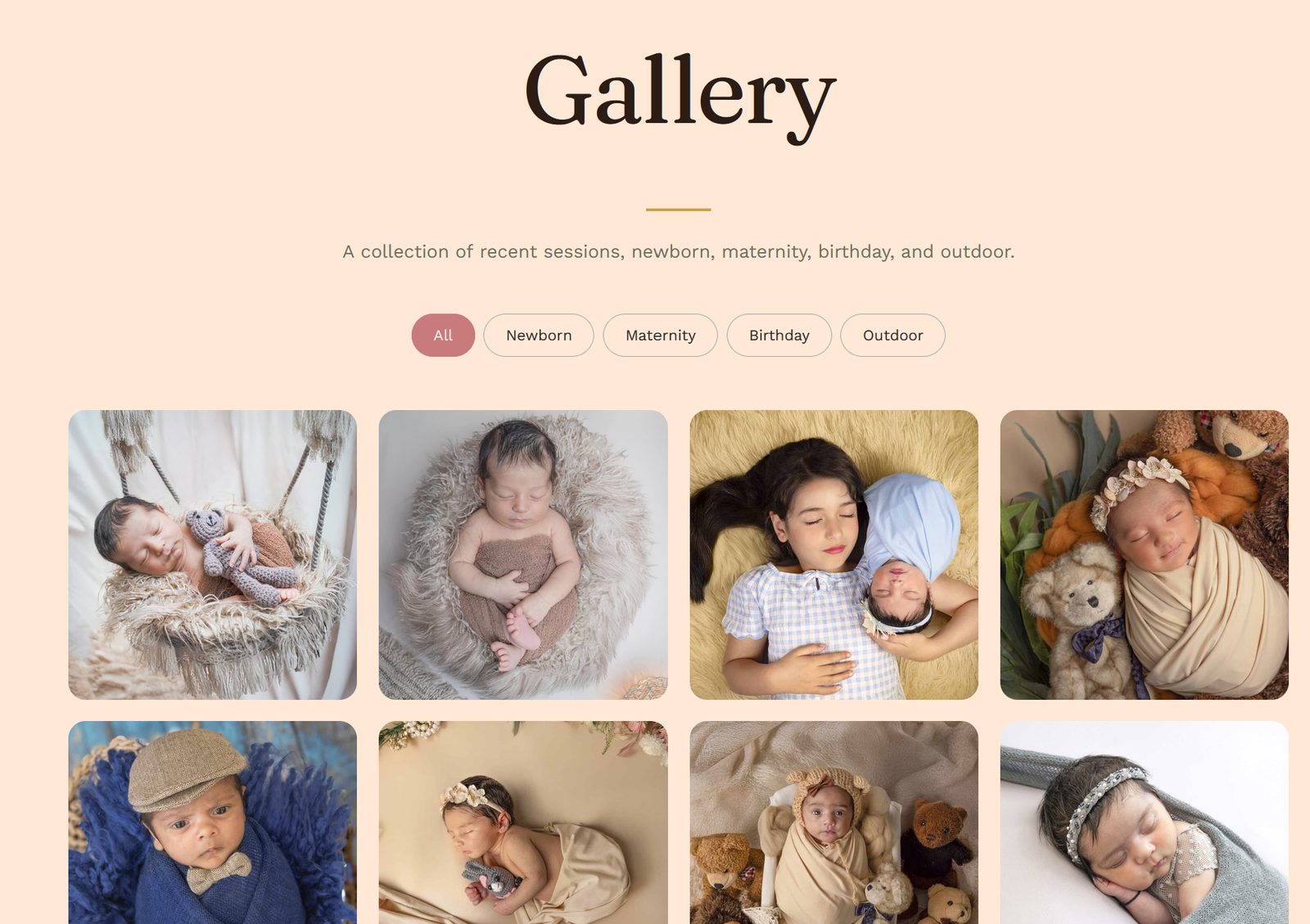
A filterable portfolio across the four session types, built on a custom Pods post type, fully alt-tagged, with every image run through ShortPixel.
Booking and contact
A booking form capturing session type, date, and contact details, plus a contact page with the real studio address and phone, a live embedded Google Map, and a direct link to the studio's Google reviews. The map uses a place-CID embed, which avoids needing a paid Maps API key.
Client-editable promotions
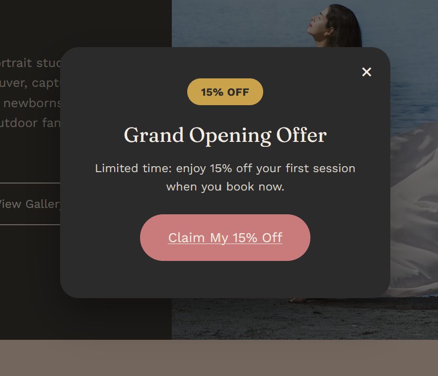
The grand-opening discount popup and its matching booking-page banner both read from one Pods-powered settings page. The owners can change the headline, discount, message, button text and link, or switch the whole thing off, without a developer. This was the requirement that most clearly pushed past what stock WordPress offers.
Legal and trust
A privacy policy covering form data, cookies, and third-party embeds, including an explicit policy on photographing minors only with guardian consent, which matters for this business in particular.
SEO and local search
- Page-level titles and meta descriptions across every page, XML sitemap submitted, on-page scoring used to tighten copy
- Hand-authored LocalBusiness JSON-LD covering name, address, phone, price range, and social links, so Google has what it needs for map packs and knowledge panels
- A descriptive alt-text pass across the entire gallery, written for people rather than stuffed with keywords
- Performance tuning through LiteSpeed Cache: minification plus selective lazy-loading, with the hero image excluded from lazy-load specifically to protect its LCP
Working with the client
This was iterative rather than a single big reveal. Most of it happened in tight feedback loops, often live and screenshot-by-screenshot:
- Rebuilt the mobile hero from scratch after the desktop-derived layout did not translate to a narrow screen, landing on a full-bleed photo with text overlay that tested better on an actual phone
- Went several rounds on the mobile header logo before it read as genuinely balanced, which meant tracking down a theme-level scaling transform that was quietly shrinking it
- Replaced the bottom navigation's active-page animation with a calmer flush highlight after the client found the original too busy
- Recategorised and recaptioned the gallery as real session photos arrived, replacing placeholders
- Ran a sitewide content correction pass on request, including removing every em dash across every page and template, and correcting the studio's description to a dedicated office rather than home-based
Every change was checked live after saving rather than assumed, and mobile fixes were verified against real device screenshots instead of emulated previews. Enough of the bugs turned out to be phantom grid columns, inline-block spacing quirks, and theme-level transforms that only appeared on a real phone.
Outcome
- A custom design system implemented sitewide, with no page-builder templates
- Four complete priced service pages and a working booking pipeline
- An SEO-optimized gallery and local search presence
- A promotional system the client runs independently, with no developer needed for day-to-day marketing
- Zero recurring software cost beyond hosting
The owners now handle content and promotions themselves. I continue as their web partner for design iteration, new features, and support as the business grows.